Get in touch
HomeAboutWorkServicesMentorshipContactGet in touch

McQueensFlower shop app

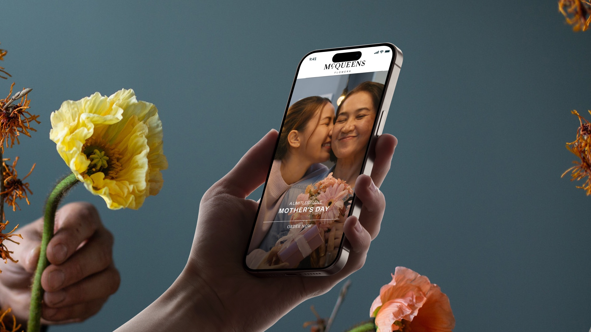
A luxury flower shop app for McQueens Flowers, made for the UK and its move into Saudi Arabia. I led the product design at Creative Chaos.

A hand holding an iPhone showing the McQueens home screen, a Mother's Day banner with a daughter kissing her mother, between yellow and coral poppies and dried witch hazel on a slate-blue wall

The short version

In a McQueens shop, a florist asks who the flowers are for. McQueens wanted its app to ask the same.

McQueens Flowers is a London florist with studios in London, New York and Seoul, and a flower school that trains florists. In 2024 it asked Creative Chaos to design its first customer app, for the UK and for its launch in Saudi Arabia and the Middle East. So the app works in English and Arabic, in pounds and riyals.

I was the lead product designer. A senior product designer worked with me, a UX strategist ran discovery with McQueens and drew the user flows, and a design manager and a project manager ran the engagement. I set the overall direction, designed most of the final screens and presented them to McQueens.

Role
Lead product designer Design direction and UI
Client
McQueens Flowers London
Platform
Mobile app English and Arabic
Team
Me and a senior product designer, with a UX strategist, design manager and project manager, at Creative Chaos
Status
Design handed off 2024
A florist's welcome, on a phone.

Most flower shops online look alike: a grid of bouquets, a price and a basket. McQueens asked us to avoid that. It wanted the app to feel like its shops, where a florist who knows the flowers helps you choose and every bouquet can be made your own.

The app also had to sell, in two languages and two markets, and make room for the school and the florists McQueens trains.

  • Flowers are for someone

    An anniversary, a birthday, Mother's Day. The occasion and the person matter as much as the bouquet.

  • Two markets at once

    English and pounds in London. Arabic, read right to left, and riyals in Saudi Arabia.

  • More than a shop

    Workshops, courses and an alumni of trained florists, all in the same app.

From grey screens to version 2.4

Weekly check-ins with McQueens, and a sign-off at the end of every step.

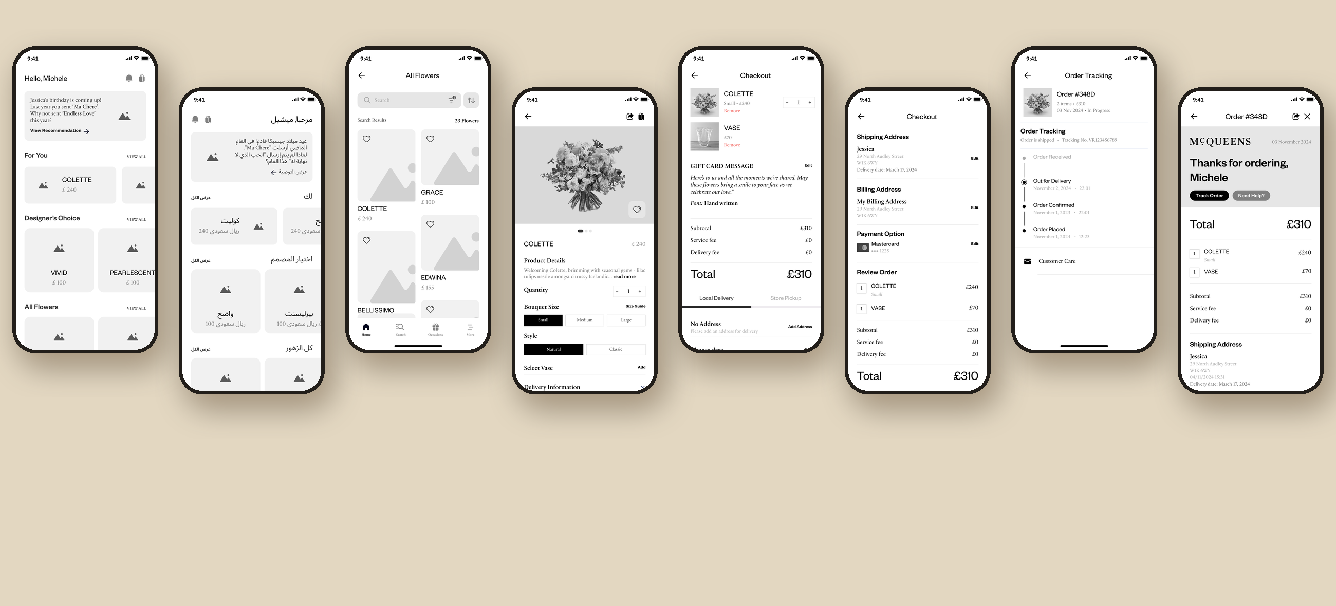
Eight grey wireframes in a row: home in English, home in Arabic laid out right to left, the flower list, a bouquet's detail page, checkout with local delivery, place order, order tracking and the thank-you screen
The wireframes, in English and Arabic, from home to order tracking
  1. 1

    Discovery

    Our UX strategist gathered requirements with McQueens and drew the user flows.

  2. 2

    Wireframes

    The shop in grey, from home to order tracking, in English and in Arabic.

  3. 3

    Moodboards

    Four directions shown. McQueens mixed them into a lighter one, our final board.

  4. 4

    Option 1

    The first concept: the shop on video and an assistance wheel.

  5. 5

    Version 2.4

    The final design, with the alumni side, delivered in Figma.

Design decisions

What I decided, and why

Each one brings the app closer to the shop floor.

Welcome

Open the app inside the shop.

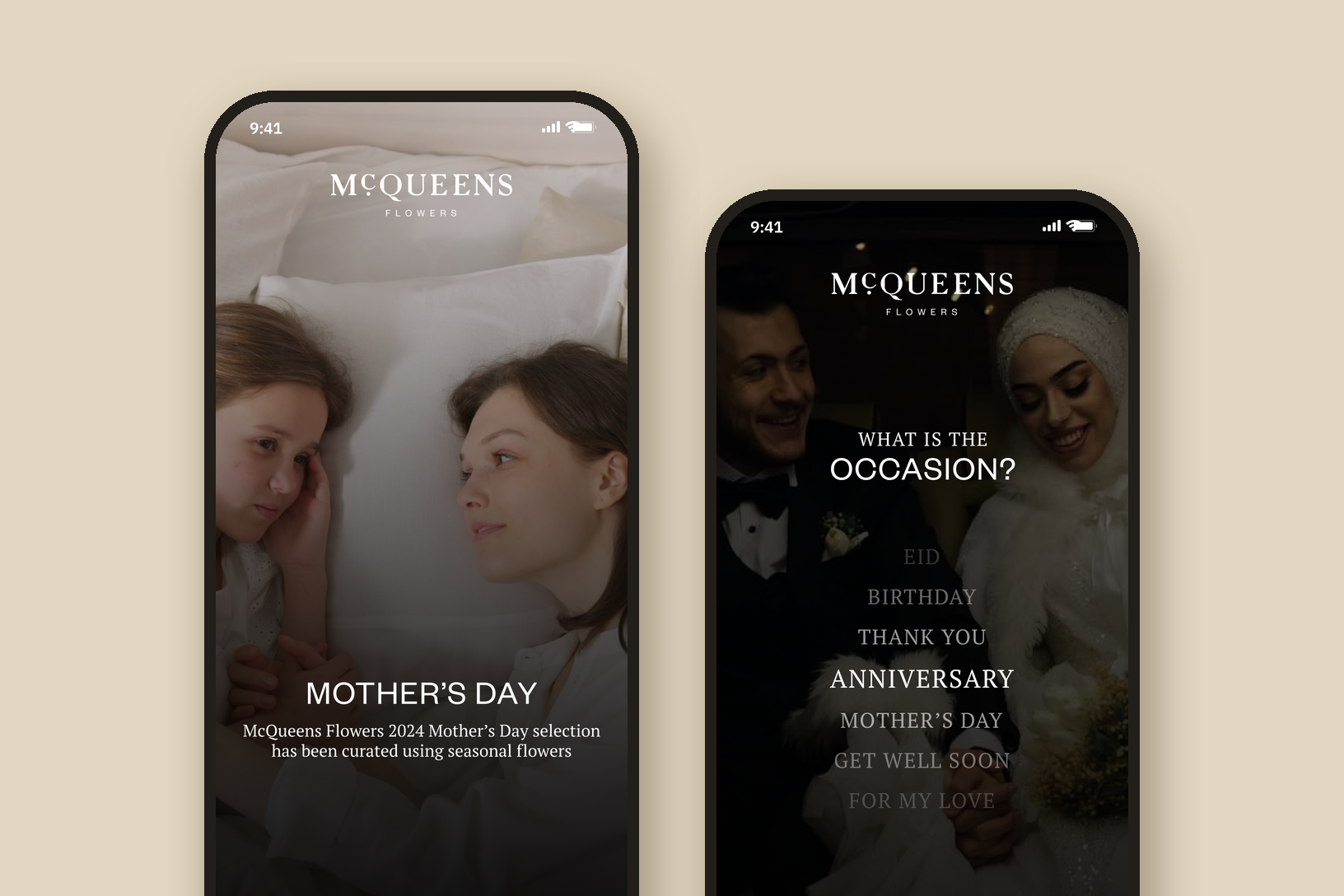
The app starts on video from McQueens' own social channels: walking through the door, flowers on every surface. The film changes with the season, so Mother's Day opens on Mother's Day. A question then fades in over it, the way a florist would greet you: what is the occasion? Skip for now is always there for people who know what they want.

Two phones on a sand ground: the Mother's Day video splash with a mother and daughter, and the first question, What is the occasion?, over a dimmed video of a couple, with a list running from Eid to For my love and Anniversary in the middle

Guidance

Three questions, then a bouquet.

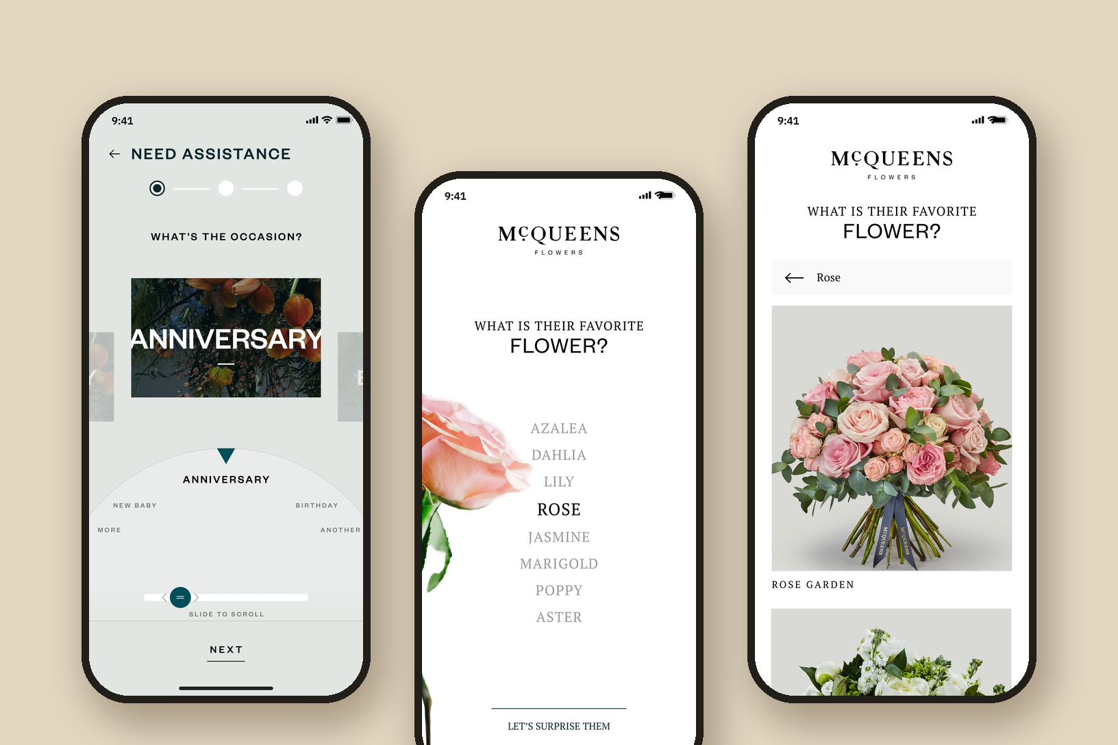
The occasion, who it is for and their favourite flower. Pick rose and the app suggests bouquets made with roses, like Rose Garden and Edwina. "Let's surprise them" is there for anyone who doesn't know. In option 1 the questions sat on a wheel. It looked the part, but it was hard to read and hard to turn with one thumb, so in version 2.4 each question became a list that settles on your answer in the middle. The senior designer on my team designed that scroller.

Three phones: option 1's Need Assistance screen with a half-circle wheel set to Anniversary, version 2.4's What is their favorite flower? list with Rose selected beside a pink rose, and the result, Rose Garden and Edwina bouquets

Gifting

Every bouquet carries a note.

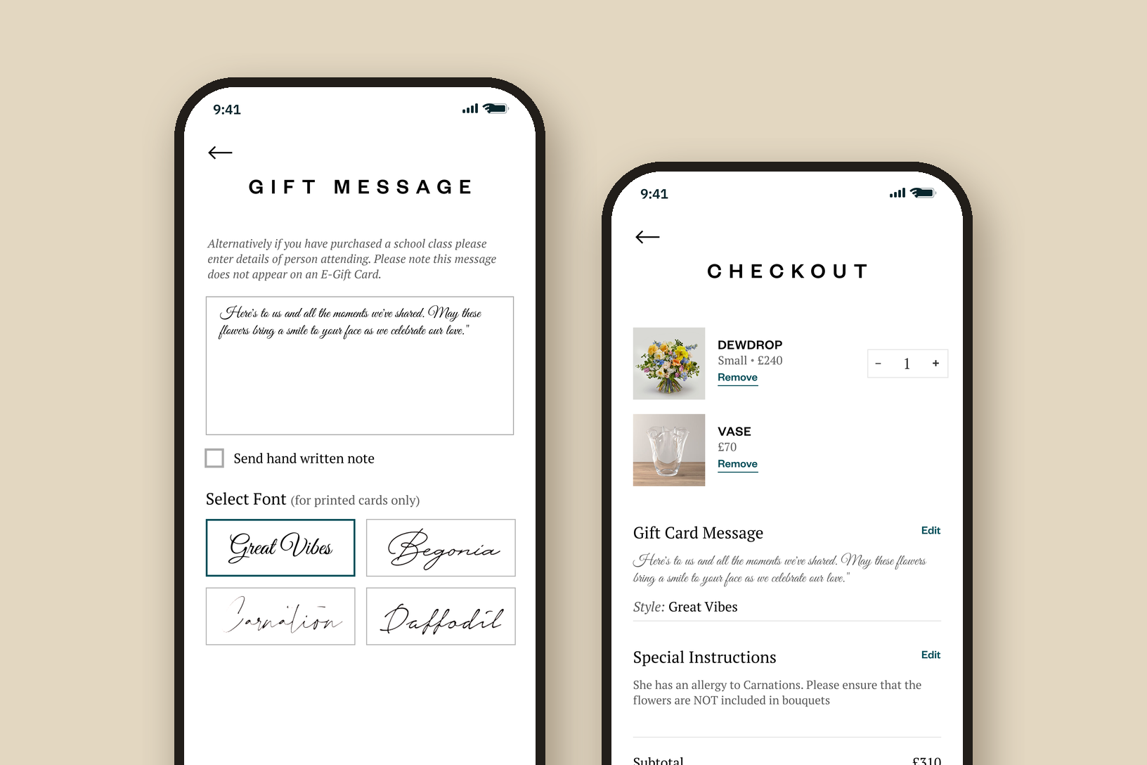
A bouquet is usually a gift, so the message gets its own screen: four handwriting fonts for the printed card, or a note written by hand. Special instructions go straight to the florist, like an allergy to carnations. Checkout splits local delivery from store pickup, and both ask for a date and a time.

Two phones: the Gift Message screen with a message in a script font, a Send hand written note option and four card fonts, and Checkout with the gift card message, a special instruction about a carnation allergy and the totals

Two markets

Arabic from the first wireframe.

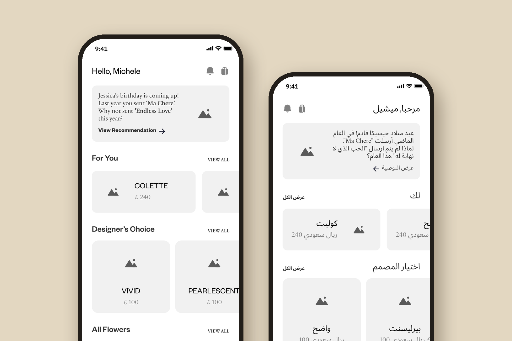
Saudi Arabia was a launch market, so the wireframes were drawn in Arabic too, with the whole layout mirrored right to left. Language and region are separate choices in the menu: English or Arabic, and the United Kingdom in pounds or Saudi Arabia in riyals. The store locator keeps UK and KSA shops in their own tabs.

Two grey wireframes of the home screen: in English with a birthday reminder, For You, Designer's Choice and All Flowers, and the same screen in Arabic, mirrored right to left with prices in Saudi riyals

Inside the app

Version 2.4, from the welcome to a tracked order.

01 / 08

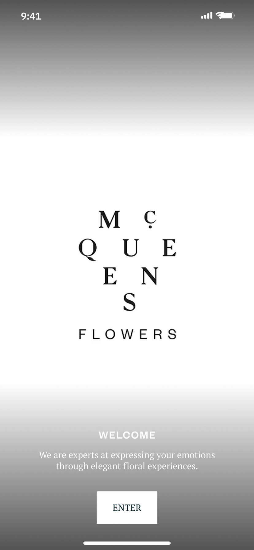
Welcome screen: the McQueens Flowers wordmark spread over three lines, the line We are experts at expressing your emotions through elegant floral experiences, and an Enter button
WelcomeThe wordmark, one line from McQueens and a way in.
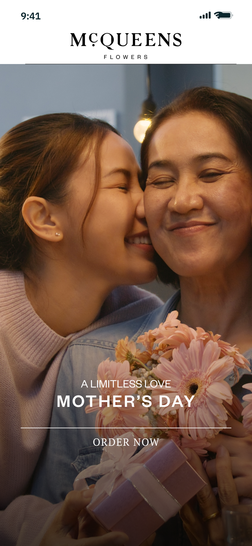
Home screen: a full-height Mother's Day banner, A limitless love, with an Order now link over a photo of a daughter and her mother holding pink gerberas
HomeOne occasion at a time, full height, with a line to order.
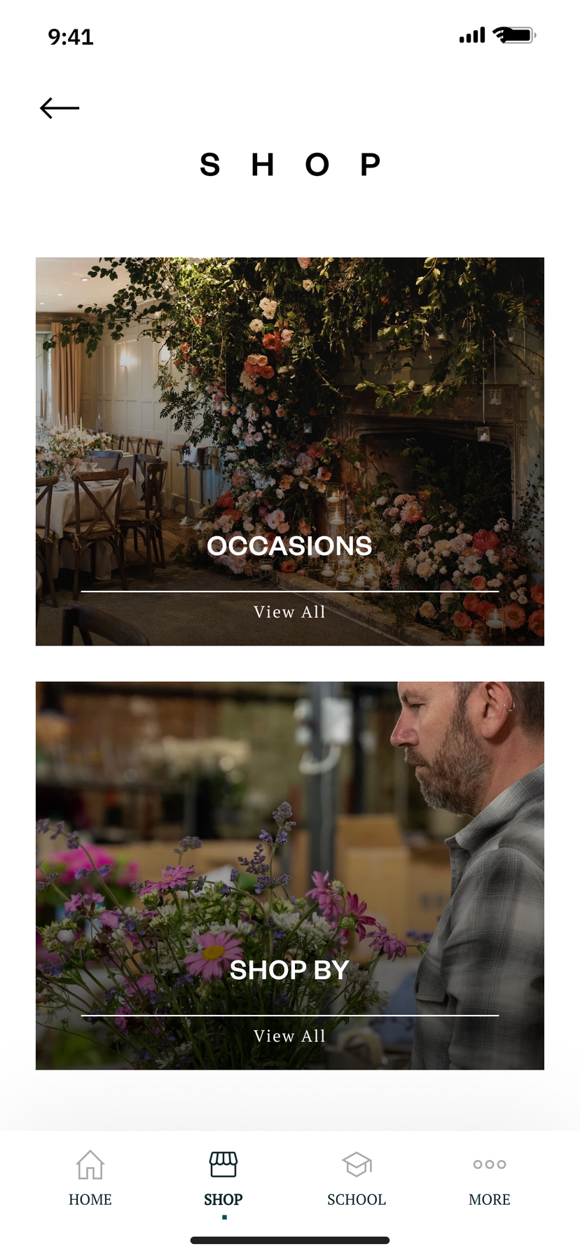
Shop screen with two large photo cards, Occasions and Shop by, and a bottom bar of Home, Shop, School and More
ShopBrowse by occasion, or by flower, colour and price.
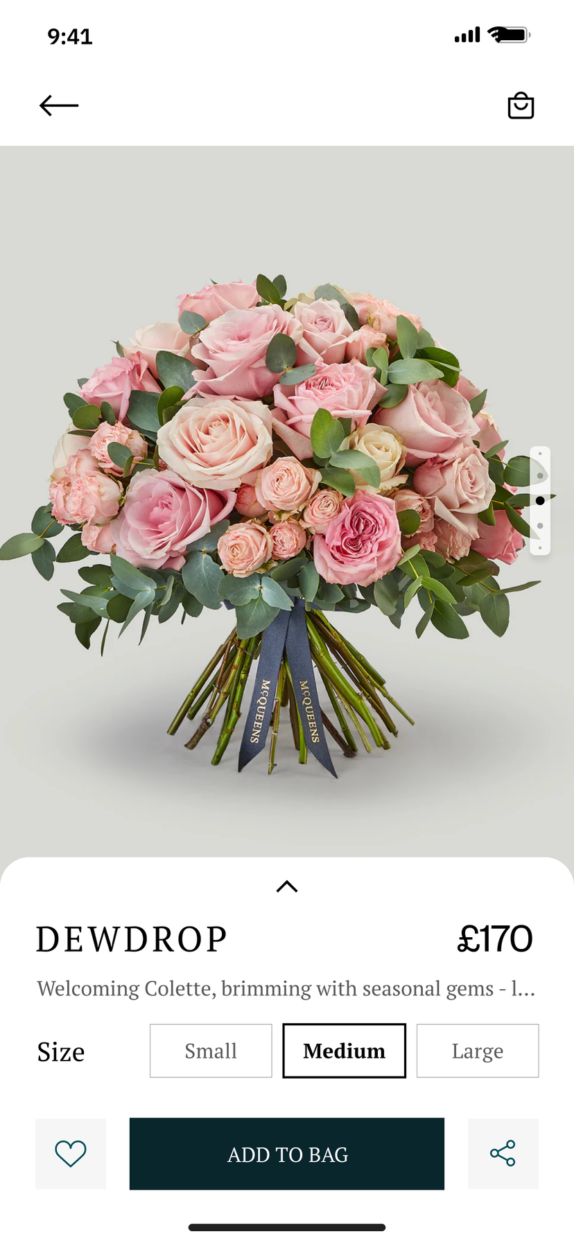
Product screen for the Dewdrop bouquet of pink and cream roses, priced at £170, with small, medium and large sizes, a wishlist button, Add to bag and share
BouquetThe flowers fill the screen. Size and the bag sit underneath.
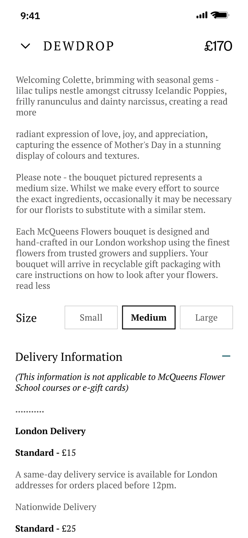
The Dewdrop product details opened up: the bouquet's description, a note that florists may substitute similar stems, size options and delivery information for London and nationwide
DetailsThe florist's description, sizes and delivery, opened on demand.
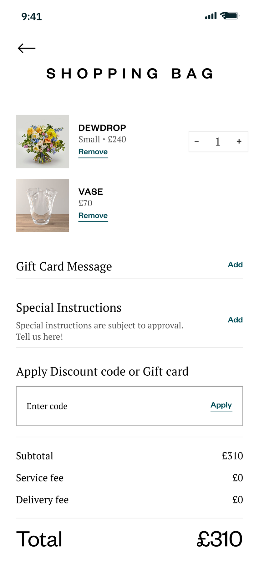
Shopping bag with the Dewdrop bouquet and a vase, a gift card message and special instructions to add, a discount code field and the total of £310
Shopping bagGift message and instructions, before the total.
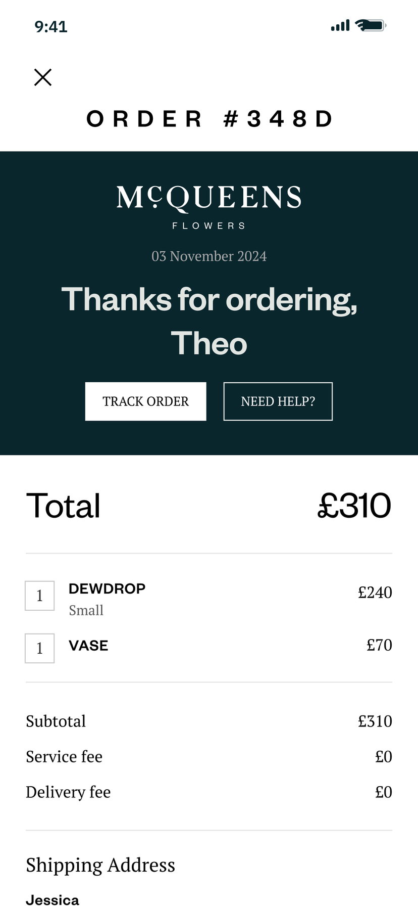
Order confirmation for order 348D: a dark green panel with the McQueens wordmark, Thanks for ordering, Theo, Track order and Need help? buttons, then the items and total
Thank youThe order on one page, with tracking a tap away.
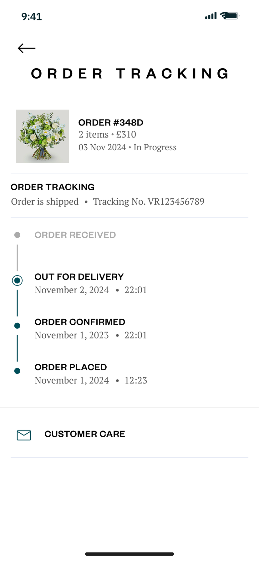
Order tracking with a timeline from order placed and confirmed to out for delivery, the tracking number and a link to customer care
Order trackingEvery step from placed to delivered.
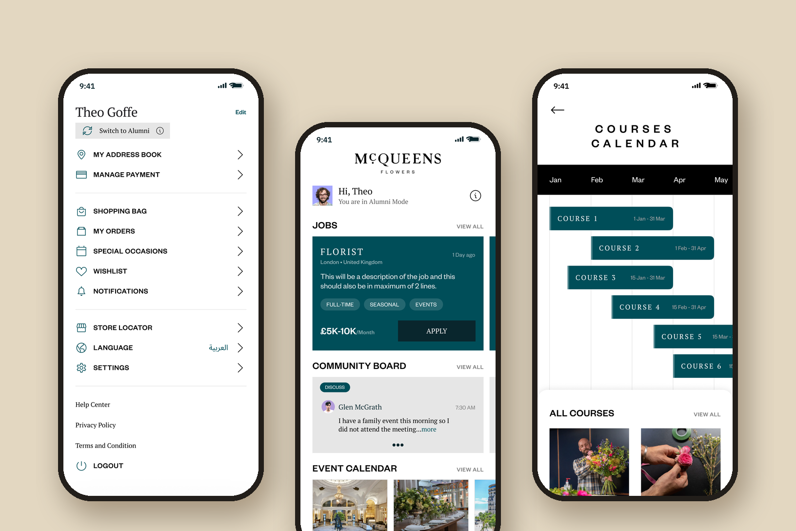
Three phones: the buyer menu with a Switch to Alumni button, the alumni home with a florist job, the community board and an event calendar, and the courses calendar with six courses laid out from January to May

A second app for florists

McQueens asked for a home for the florists it trains. Anyone can apply to join the alumni when they sign up, and an admin checks and approves them. Approved members get a switch in the menu that turns the shop into the alumni app, and one tap switches them back to buying flowers.

  • Alumni list
  • Jobs
  • Chat
  • Community board
  • Events
  • Workshops
  • Courses calendar
  • News and learnings

McQueens' brand, made lighter

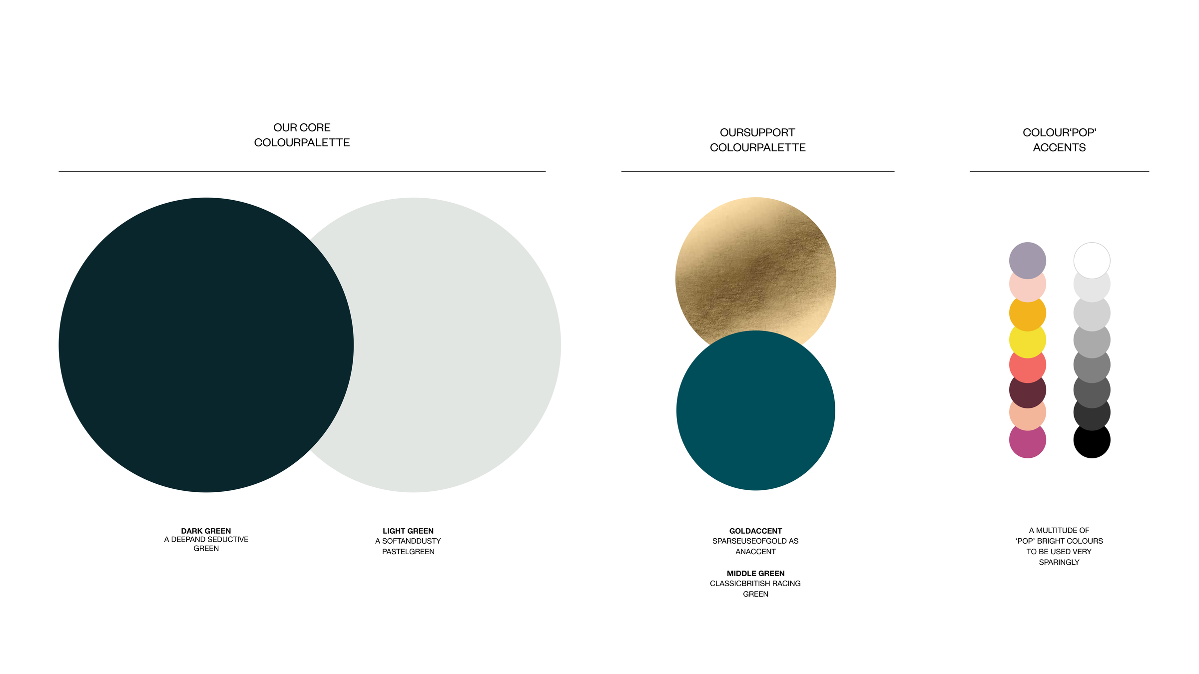
McQueens gave us its brand guide, and we used as much of it as we could: Founders Grotesk for headlines, a deep dark green, a soft light green, a racing green and gold used sparingly. For the feel of a luxury house we looked at Van Cleef & Arpels, Chanel and Gucci. We showed McQueens four moodboards. It mixed and matched them toward a lighter tone, and we made that one final board before designing a screen.

  • Brand guide by McQueens
  • Four moodboards, then one final board
  • A type system for the app, built on the guide
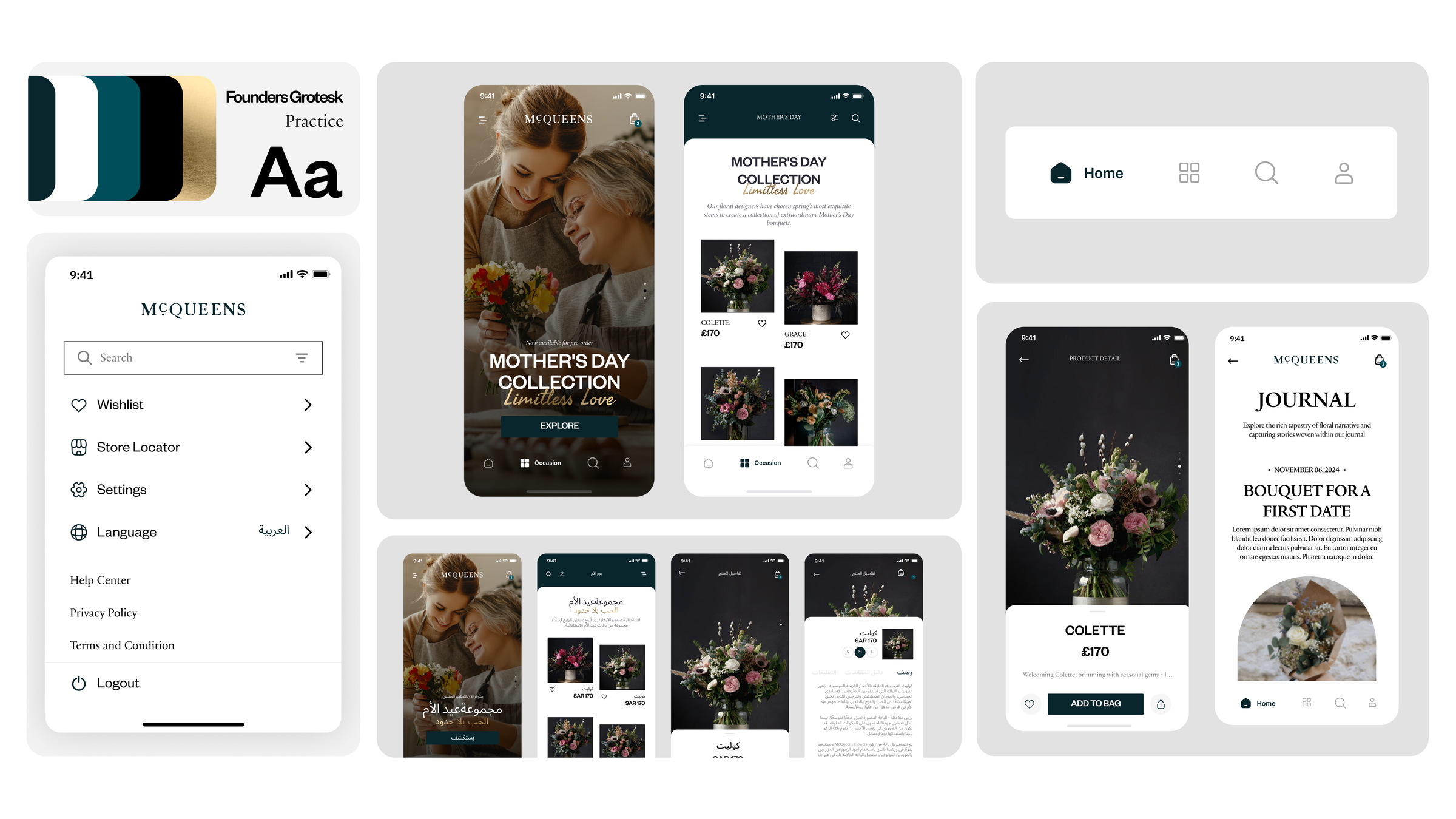
The final moodboard: dark green, white, racing green, black and gold swatches, Founders Grotesk and a serif, a menu screen with an Arabic language option, a Mother's Day collection in English and Arabic, a bottom bar and a product and journal screen
The final board, made from the four directions
Brand guide colour page: dark green and light green as the core palette, gold and a middle racing green as support colours, and two columns of pop accent colours and greys to use sparingly
The palette from McQueens' guide
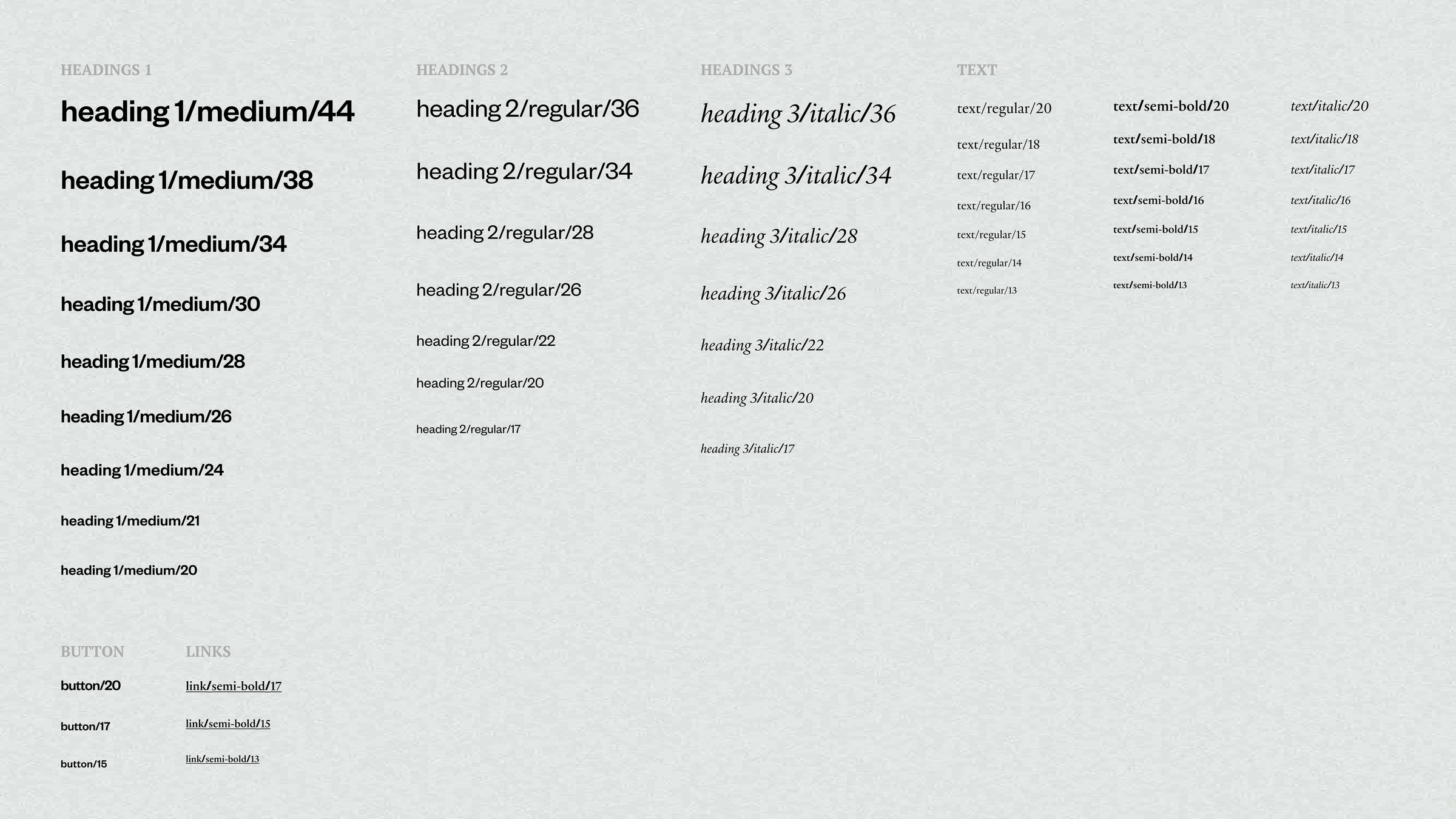
The app's type system on a textured light green ground: heading 1 in medium from 44 to 20, heading 2 in regular, heading 3 in a serif italic, text in regular, semi-bold and italic from 20 to 13, plus button and link styles
The app's type system, three heading styles and the text sizes

Delivered to McQueens

Handed
off

Version 2.4, delivered in Figma in 2024

We handed McQueens the final designs for the shop, the school and the alumni side, in English, with the Arabic layout set in the wireframes. Who builds the app, and when, is McQueens' call.

User flows
From discovery with McQueens, by our UX strategist
Wireframes
The shop from home to order tracking, in English and Arabic
Moodboards
Four directions, then one final board
Visual design
Option 1, then version 2.4: shop, checkout, school and alumni

What I learned

Designing for a luxury shop

  • Start from the shop floor

    McQueens' best brief was a scene: someone walks in, and a florist asks how to help. Designing that greeting first decided most of what came after it.

  • Try it in the hand

    The wheel looked luxurious on a board. On a phone, a plain list was easier to read and to use. The luxury held up in the photos, the type and the pace.

  • Look outside the category

    We studied jewellery and fashion houses, not other florists. Their restraint left room for the flowers.

McQueens asked for the feeling of walking into its shop and being looked after by someone who knows flowers. My job was to put that florist inside the app, and keep the shop easy to buy from. The three questions are where it shows most.
Zair Abbas, lead product designer

Get intouch

Building a shop app that has to feel like your brand? Send me the brief, and I'll show you where I'd start.

Get in touch