Though it’s a bit late to post something about 2015 but better late than never.
By 2014, we (the web designer/developers) have followed trends like Metro UI Design, Responsive Web Design for smaller devices only, Parallax limited to brands, but now things have changed.
This post covers some of the latest trends and best practices of web design to be followed in 2015 & 2016.
Mobile first, but also Upwardly Responsive

Till 2014, it was all about ‘Mobile first’. Unfortunately that means that things look great on mobile and dreadful on desktop and tablet.
Plenty of brands adapting their websites for mobile and tablets, now responsive design should work for bigger screens too.
Don’t show everything on smaller screens

On mobile, you can simplify the layout by hiding content that would be visible on larger screens, Bootstrap’s Responsive Utilities come really handy here for Web Developers. You can hide the elements completely or convert them into tabs and accordions to show/hide content. This will help you to de-clutters the page on smaller screens and lets the user see all the key info, with options to view more if they want to.
Show more on wider screens

Just keeping your website max-width to 1170px is not the scene anymore. You have to show more content as people are using larger screens at home and offices. Apple launched 5K iMac, now imagine how small your website going to look, if you are just keeping it to 1170px width. Having a wider screen allows you to show more content further up the screen & before the user have to scroll. Layouts can expand and accommodate more columns.
Micro UX Effects

Micro UX design is like making small and simple animations or effects that delight the user that not only makes a task easier, but also creates an engaging experience that user would like to use it again. E.g.: Swiping right on MailBox app submit your email into Archive from Inbox.
Material Design

The meeting point between skeuomorphism and entirely flat design. Google states that their new design language is based on paper and ink.
Unlike real paper, digital material can expand and reform intelligently. Material has physical surfaces and edges. Seams and shadows provide meaning about what you can touch.
Click here to learn more about Material Design from Google.
Ghost Buttons

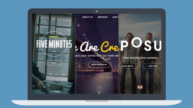
These buttons are there but they aren’t diverting your focus from the video playing in the background or the cover image in the header. These buttons are transparent but have a recognisable shape, bordered with a thin solid line and contain light sans-serif fonts.
One Colour? Use shades

Your brand has one colour? No problem.
By using shades of same colour can create various shades and then offsetting it against a neutral background you can create a rather elegant looking interface and user don’t get bored.
Hidden or Sliding Menus

It’s becoming more popular for websites to hide navigation off screen until you interact with an element towards the top left or right of the screen.
They could be sliding menus from left or right or cover fullscreen with menu items in it.
Scrolling… not clicking

Now the devices are smaller, taller, wider, and longer.
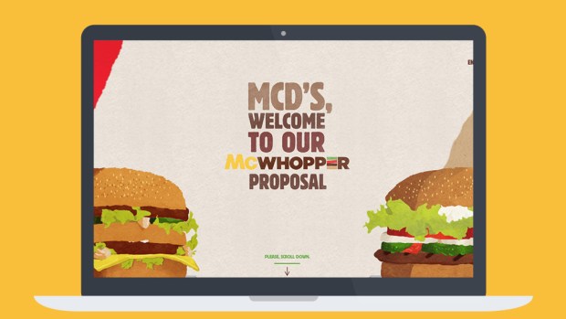
Scrolling through webpages is far quicker than clicking. Now it’s not important to show everything above the fold. Let pages breath and expand with content blocks and generous spacing.
People have learned to scroll. By giving them more content below the fold, you’re actually inviting them to be more engaged with the page and to see your content.
Optimal Content Area Widths

Keep your textual area line lengths at about 60-75 characters by setting your text areas max-width to 500-700 pixels.
Making a layout wider on larger screens, it is important to consider the line lengths of your content so users eyeballs or head doesn’t get hurt after reading your content on big screens.
Stop using click to enlarge

Replace enlarge image functionality with long scrollable gallery pages.
On small devices, having an enlarge image window doesn’t work if the image you are already looking at fills the screen.
For image galleries, use a long scrollable page, or a swipe-able carousel with left/right arrows. The long scrollable gallery also works well on tablet and desktop.
Put important stuff on top for mobile

Show important stuff like call to actions, contact info, buy buttons, etc. at the top on mobile. Mobile users want information quickly, but this also works well on any device.
Add gestures for touch screens

Add swipe, hold, tap or pinch gestures for images, carousels, accordions, drop downs & menus.
Touch screens are by nature intuitive to use, therefore we can be more subtle with touch gestures, e.g an image carousel with bullet pagination suggests that there is more content on swipe to come.
Hover are inconsistent on touch screens. Disable these and replace with touch events.
Change the order of content blocks for mobile

Decide what is more important to show first on a small screen, then change the content order around – CSS and JS can help you to achieve this on responsive.
More…
- Say bye bye to Flash Player
- Avoid overuse of Popup and Modal Boxes
- Optimize images & videos for responsive
- Don’t show too many ads
- Stop Auto Playing anything
- Use loaders if your website is heavy
Sell from website…
- Add e-commerce power to your website
- Let your customer manage, upgrade or customize their accounts directly from the website
- Make the buying part easy. Don’t complex it for your user so they change their mind
- Get reviews & feedback from customers and showcase them on your website
- Give special discounts to user who make an order through your mobile app
That’s it for now. Thank you for reading.
Be First to Comment